Note
Go to the end to download the full example code.
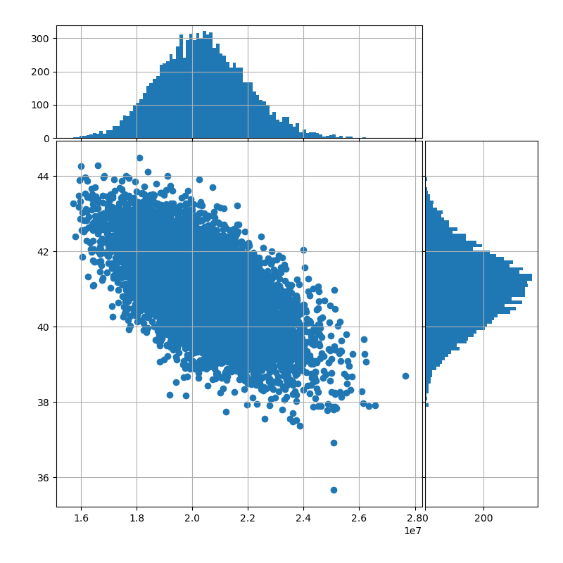
Account value to number of policies#
This graph uses the CashValue_ME_EX2 model
from 2. Extended Stochastic Example,
and shows path dependency of policy decrement.
The scatter plot shows how the number of policies at maturity varies by the level of account value at maturity, and the graphs on the sides show the distributions of the two factors.
See also
2. Extended Stochastic Example notebook in the
savingslibrary
# The code below is based on the sample script available on
# https://matplotlib.org/stable/gallery/lines_bars_and_markers/scatter_hist.html
# See accompanying LICENSE_MATPLOT.txt for its terms of conditions.

import numpy as np
import matplotlib.pyplot as plt
import modelx as mx

def scatter_hist(x, y, ax, ax_histx, ax_histy):
    # no labels
    ax_histx.tick_params(axis="x", labelbottom=False)
    ax_histy.tick_params(axis="y", labelleft=False)

    # the scatter plot:
    ax.scatter(x, y)

    def get_bins(data, binsize):
        ub, lb = np.max(data), np.min(data)
        binwidth = ((ub - lb) / binsize)
        return np.arange(lb, ub + binwidth, binwidth)

    xbins = get_bins(x, 100)
    ybins = get_bins(y, 100)
    ax_histx.hist(x, bins=xbins)
    ax_histy.hist(y, bins=ybins, orientation='horizontal')


# definitions for the axes
left, width = 0.1, 0.65
bottom, height = 0.1, 0.65
spacing = 0.005

rect_scatter = [left, bottom, width, height]
rect_histx = [left, bottom + height + spacing, width, 0.2]
rect_histy = [left + width + spacing, bottom, 0.2, height]

# start with a square Figure
fig = plt.figure(figsize=(8, 8))

ax = fig.add_axes(rect_scatter)
ax_histx = fig.add_axes(rect_histx, sharex=ax)
ax_histy = fig.add_axes(rect_histy, sharey=ax)
ax.grid(True), ax_histx.grid(True), ax_histy.grid(True)

m = mx.read_model('CashValue_ME_EX2')

x = m.Projection[5].claims_from_av(120, 'MATURITY')
y = m.Projection[5].pols_maturity(120)

# use the previously defined function
scatter_hist(x, y, ax, ax_histx, ax_histy)

m.close()
Total running time of the script: (0 minutes 1.655 seconds)